A great WordPress.com site

Image

Dragon Pine by Wu Boli

Created: ca. 1400 

Material: Hanging scroll; ink on paper


            Wu Boli was a Daoist priest at the Upper Purity Temple of Mount Longhu, Jiangxi Province who lived during the late Yuan and early Ming dynasties. [1] Wu Boli was also a painter, and he specialized in scenes portraying withered trees, bamboo, and stones. [2] The exact date when Dragon Pine was created is not known, but it is believed to have been created around 1400 (Wu Boli lived during the mid/later 14th century to the early 15th century). [3] This work was painted for Zhang Yuchu, who was the 43rd Celestial Master of the Zhengyi order, [4] and a famous painter [5].

            Due to their ability to remain green throughout the winter, pine trees were seen as symbols of survival, longevity, and the moral character of the virtuous man. [6] Also, according to the Metropolitan Museum of Art “with their twisting trunks, lichen-studded bark, and exposed roots, [pine trees] recall the coiled body, powerful talons, and bristling scales of a dragon” [7], which is probably why this work is called Dragon Pine.  I thought this was a really interesting idea, because, in my opinion, pine trees do not resemble dragons. However, in this work, parts of the tree do look like a dragon. Some of the branches look like part of a dragon’s tail, and much of the bark resembles scales. To me the thing that is particularly dragonesque about this tree is its shape; it is very flowing and graceful, which reminds me of dragons as they are often depicted in Chinese art.

            I really liked this work, and it caught my attention right away. It’s a simple work, there’s not a whole lot going on, but it is very beautifully done. At the same time there’s quite a lot of intricate detailing, especially on the needles and bark, which I really like. Looking at this piece makes me feel very serene and relaxed.


1 http://www.metmuseum.org/toah/works-of-art/1984.475.3

2 Little, Stephen and Eichman, Shawn. Taoism and the Arts of China. Chicago: The Art Institute of Chicago. 2000  

3http://www.metmuseum.org/toah/works-of-art/1984.475.3

4 http://www.metmuseum.org/toah/works-of-art/1984.475.3

5 Little, Stephen and Eichman, Shawn. Taoism and the Arts of China. Chicago: The Art Institute of Chicago. 2000  

6 http://www.metmuseum.org/toah/works-of-art/1984.475.3

7http://www.metmuseum.org/toah/works-of-art/1984.475.3


Image

Henry Ford Hospital (The Flying Bed) by Frida Kahlo

Created: 1932

Material: Oil on metal

Frida Kahlo is a very famous Mexican artist who is particularly famous for her self-portraits. [1] Kahlo faced many challenges throughout her life, including a variety of medical problems.

Many of Kahlo’s medical problems originated from an accident on September 17, 1925 when the bus she was riding on collided with a streetcar. The accident resulted in several fractures in her right leg, broke her pelvis, spinal column, collarbone, and ribs, crushed and dislocated her right foot, and dislocated her shoulder. In addition, a handrail pierced Kahlo’s abdomen and uterus. [2]

The accident had a profound impact on Kahlo’s life; she suffered relapses of extreme pain throughout the rest of her life, and it prevented her from having children. [3] This accident marks the beginning of Kahlo’s career as an artist (she painted while she was bedridden for many months with nothing to do). [4] When looking through Kahlo’s works, it became apparent that this accident influenced many of Kahlo’s works.

In 1932, Kahlo suffered her second miscarriage (she would suffer a total of three miscarriages in her lifetime, and she never did carry a pregnancy to full term, due to her injuries in the accident). [5] This miscarriage was what prompted the creation of Henry Ford Hospital [6].

When I saw this work, my first thought was that it is an incredibly powerful image. Kahlo does an amazing job showing the pain and loss she was feeling after her miscarriage. I really like the vivid colors Kahlo uses in this work, but I don’t really like the visual style in this work (or most of Kahlo’s works in general). It’s just doesn’t appeal to me the same way as other artists. However, this work (and many of Kahlo’s other works) grabs my attention because of the emotion behind them. To me this work conveys a strong sense of sorrow and loss, and that’s why it really stood out to me, and why I chose it for this assignment.

References:

1 http://www.britannica.com/EBchecked/topic/309679/Frida-Kahlo

2 http://en.wikipedia.org/wiki/Frida_Kahlo

3 http://en.wikipedia.org/wiki/Frida_Kahlo

4 http://en.wikipedia.org/wiki/Frida_Kahlo

5 http://en.wikipedia.org/wiki/Frida_Kahlo

6 http://www.fridakahlofans.com/c0090.html

The theme of my virtual exhibit is fantasy, and it features some of the works of James Gurney and James Christensen.

James C. Christensen is an American artist. He was born in September of 1946, and grew up in Culver City, California. He attended Brigham Young University and the University of California at Lost Angeles. He taught art professionally for over 20 years. Christensen works with a variety of mediums, in addition to his paintings, he also creates etchings and porcelain and bronze statues. He has also created five books and a series of interactive journals. Many of his works are influenced by myths, fables, and legends, but many of his works also portray biblical stories as well. [1]

I’ve been familiar with Christensen’s artwork from a very young age, because he co-authored (along with Renwick St. James and Alan Dean Foster [3]) and illustrated one of my favorite books as a child, Voyage of the Basset. I absolutely love Christensen’s works, in part because of the subject matter, and in part because of the intricacy and detail found in his works.

James Gurney is an American painter and author. He was born in California in 1958. He studied archeology at the University of California at Berkeley. In 1982 he worked as a background painter for the animated film Fire and Ice and also co-authored The Artist’s Guide to Sketching. He worked as a freelance illustrator, illustrating paperback book covers, and he worked on several assignments for National Geographic Magazine, painting reconstructions of ancient civilizations. His work researching scenes of ancient life for National Geographic provided the inspiration for his book Dinotopia: A Land Apart from Time, which was published in 1992.  [3]

I am familiar with Gurney’s works because of his Dinotopia series. My great-grandparents have two of his Dinotopia books (and Voyage of the Basset, I believe), and when I was little and we were visiting them, I would spend a long time looking through the pictures in the books. Gurney’s works really remind me of art from the Romantic era, and I like artwork from the Romantic period, so I like Gurney’s works quite a bit.

When I was little, both Dinotopia and Voyage of Basset were actually rather long and difficult for me to read, but I would spend a long time looking at the pictures in the books. I still love both Christensen and Gurney’s works, especially for their depictions of fantastic creatures and situations.

*As a side note, I had a hard time finding dates for many of these works, so what I did is I put the date that the book they were in was published for the date the works were created.

Image

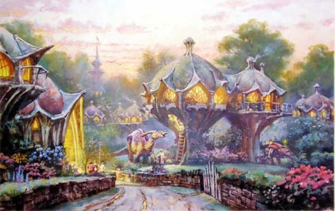
James Gurney Twilight in Bonabba from Dinotopia: World Beneath (1995)

I really love the colors and the lighting in this piece. This work has a very serene feel to it, and for some reason, the style of the houses makes me think of little fairy houses. This work ties into my theme for a variety of reasons. First of all, the architecture of the houses, in my opinion, is pretty fantastical, because it’s not a structure that you would normally find for a house. The other thing that makes this piece fit into the theme of fantasy is how the dinosaurs and humans are living together and forming symbiotic relationships with each other.

Image

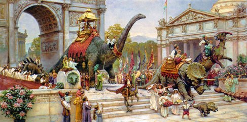
James Gurney Dinosaur Parade from Dinotopia: A World Apart from Time (1992).

The architecture in this work reminds me of Rome or Greece for some reason, but I’m also reminded of France, specifically the arc de triomphe. I like this work, and I love looking at all of the intricacies in this piece. My favorite part of this work is probably the little children in the front of the picture walking with the baby dinosaur. I think that’s really cute. This work ties into the theme of fantasy due to its subject matter, since dinosaurs and humans never formed a civilization where they lived together.

Image

James Gurney Mountain Tribesman from Dinotopia: Journey to Chandara (2007)

I really like the background in this piece, it kind of reminds me of Alaska, or somewhere on the Northwest Coast. This work looks like it would be right at home in an issue of National Geographic, which would make sense since Gurney did work for them a few times. This work ties into the theme of fantasy for the same reason as the other Gurney pieces in that it shows humans and dinosaurs creating a civilization where they live and work together.

Image

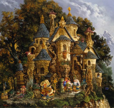
James Christensen College of Magical Knowledge from Voyage of the Basset (1996)

I love this piece, because there are so many little things that I didn’t catch at first, but then when I look at it a second time, I wonder how I missed seeing that the first time. One example is the bear head (maybe a carving?) below the pot of flowers, right next to the professor with the staff. I’m also curious what the one person is trying to catch by using butterflies as bait. This work, along with almost all of Christensen’s works from Voyage of the Basset tie into the fantasy theme because they show a magical world full of strange creatures and people.

Image

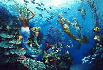
James Christensen Sisters of the Sea from Voyage of the Basset (1996)

I really love the colors in this piece; they are so vivid and bright! Also, Christensen did a great job with all of the detail in the fish and coral reef. Also, as an interesting side note, fish are a fairly common motif in Christensen’s works, and some of his paintings even include fish on a leash. This work ties into my theme, because it is depicting mermaids, which are creatures from myth and legend.

Image

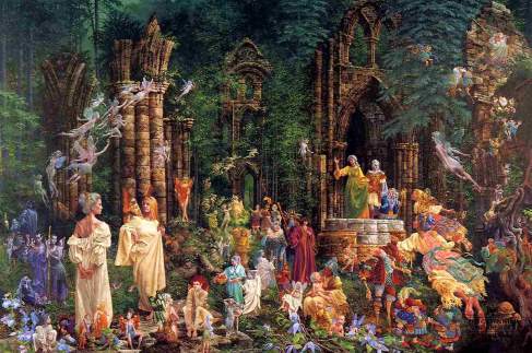
James Christensen Court of the Faeries from Voyage of the Basset (1996)

This was probably one of my favorite pictures from Voyage of the Basset when I was a kid, and my parents actually bought it several years back, and it was hanging over our fireplace, until we moved it to another room (James Christensen is my mom’s favorite artist). This work shows the Court of Oberon and Titania. Titania is the fairy in green, waving to the rest of the fairies, and Oberon is in red, and standing right behind her. I like the variety that Christensen puts into the fairies; they are all very different. Some are very realistic and human-like, but some are more comical and lest realistic. This work ties into the theme of fantasy due to its portrayal of fairies and a variety of legendary characters or creatures.

[1] http://www.greenwichworkshop.com/christensen/

[2] http://en.wikipedia.org/wiki/Voyage_of_the_Basset

[3] http://jamesgurney.com/site/biography

Image          

 The work I have chosen to analyze for this assignment is Guernica by Pablo Picasso. This piece was created in Paris, and Picasso worked on it from May 1 1937 to June 1937. It is a 137.4x in. by 305.5 in. oil on canvas, and it currently hangs in the Museo Reina Sofia, in Madrid, Spain. [1]

            Let me start off by being completely honest. In general, I’m not that fond of Early Modern visual arts. I like a lot of Early Modern music (I love Igor Stravinsky’s Firebird Suite, and I like American Jazz). I also don’t mind most early modern theatre (I had to read two of Ibsen’s plays in high school, and they were somewhat interesting). However, when it comes to early modern visual art, it’s generally not my cup of tea. There are some artists’ whose works I like, such as Salvador Dali, Edward Hopper, and Georgia O’Keefe. I’m not saying I think the art from this period is bad or anything, just that I don’t like it as much as other styles we’ve seen, like Impressionism or Romanticism. I’m also usually not a big fan of Pablo Picasso’s works, however, Guernica is the exception.

            Right away this work jumped out at me, because it seemed so dark. The only colors in the work are varying shades of black, grey, and white. I didn’t know what exactly was going on in this work, but I could tell that something bad was happening, or had happened. Many of the people (and the horse) seemed to be in extreme agony, and the look of concern on other people’s faces seemed to suggest that some sort of terrible tragedy had occurred. I was instantly captivated and intrigued, so I looked up the history behind the painting, which was the other reason this work caught my attention.

            I think that Picasso did an amazing job with this piece, and it truly captures the tragedies of war. The reason I like this work so much is because it is very powerful; I think it perfectly conveys the horrors of war and it’s impact on innocent civilians.  One website describes Guernica as “modern art’s most powerful antiwar statement” [2], which I think is a very good description of this piece. What really stands out to me in this work is the look of concern on the face of the person holding a candle, my eyes is constantly drawn back to this part of the work.Image

            The history behind the work is quite tragic; it was inspired by an event during the Spanish Civil War. The Spanish Civil War was a major conflict in Spain from July 17, 1936 to April 1, 1939, and was caused by a variety of factors. There are a few important facts you need to know to understand the history of this painting. First of all, Francisco Franco was the leader of the Nationalists, who opposed the Republicans and he had support from German leader Adolf Hitler, and Italian leader Benito Mussolini (Franco ended up winning the war). [3] Also, Guernica is a town in the province of Biscay in Basque Country, Spain, and it was regarded as the northern bastion of resistance as well the epicenter of Basque Culture throughout the civil war. [4]

            On April 26, 1937, German warplanes Hitler had lent to support the Nationalists bombed the town of Guernica for about two hours. Guernica was a quiet town; it had a factory on the outskirts of town that manufactured war products (ironically this factory was not damaged in the bombing), and most of the town’s men were out fighting in the civil war, thus the inhabitants were mostly women and children. [5] Therefore, this bombing was carried out in order to intimidate and demoralize the Republicans. The official Basque figures state that 1,654 civilians were killed due to the attack (however German sources reported only 300 civilians killed). [6]

            Once Picasso heard about what had happened at Guernica, he immediately began working on Guernica. The work debuted at the Spanish Pavilion in the Paris Exposition in July 1937 [7]. It initially received lukewarm reviews. After the Exposition, it toured around Europe and North America, and was eventually housed in the New York City Museum of Modern Art. [8] In 1992 the work was moved to the Museo Reina Sofia in Madrid, which is where it is currently housed. [9]

             This painting indirectly shows the impacts of World War I (WWI) and advancements of science and technology, particularly military technology. First of all, the attack on Guernica wouldn’t have been possible without the invention of airplanes, which were developed during the Early Modern period (the first powered flight was made in 1903 by the Wright Brothers). [10] Obviously if the attack hadn’t taken place, this piece would not have been created, therefore this piece indirectly shows the impact of new technologies developed during this period. This work also shows the impacts of WWI, in an even more indirect way. Franco was given the planes to bomb Guernica with by Adolf Hitler. Many historians argue that Hitler was able to gain power because of the aftermath of WWI. Germany was heavily punished for their involvement in WWI, and their economy was in ruin after the war. The general atmosphere of dissent and economic ruin that followed WWI, combined with Hitler’s effective propaganda and oratory skills, allowed Hitler to come to power. [11] By rising to power, Hitler rose to a position where he could lend planes to Franco to bomb Guernica.

             Although I am not generally a huge fan of his work, Picasso did an amazing job with this work, and it remains a powerful reminder of the tragedies of war and the suffering it inflicts on individuals.


References:

[1] http://en.wikipedia.org/wiki/Guernica_(painting)

[2] http://www.pbs.org/treasuresoftheworld/a_nav/guernica_nav/main_guerfrm.html

[3] http://en.wikipedia.org/wiki/Spanish_Civil_War

[4] http://en.wikipedia.org/wiki/Guernica_(painting)

[5] http://en.wikipedia.org/wiki/Guernica_(painting)

[6] http://en.wikipedia.org/wiki/Guernica_(town)

[7] http://en.wikipedia.org/wiki/Guernica_(painting)

[8] http://www.pbs.org/treasuresoftheworld/a_nav/guernica_nav/main_guerfrm.html

[9] http://en.wikipedia.org/wiki/Guernica_(painting)

[10] http://en.wikipedia.org/wiki/Wright_brothers

[11] http://www.bbc.co.uk/schools/gcsebitesize/history/mwh/germany/hitlerpowerrev2.shtml

            I enjoy Impressionistic style, and in general, I find it very appealing. One of the main reasons I like Impressionism so much is because it is radically different from any other style that preceded it.

Impressionism was a major movement in the visual arts that primarily took place between 1867 and 1886 [1]. Impressionist paintings sought to depict a fleeting moment, and create an impression that was open to the viewers’ interpretation. In Impressionist style, the techniques used by artist were considered more important than what the painting portrayed. Some techniques used by Impressionist painters included sketchy lines, loose brush strokes, and dabs of color. By placing colors side by side, with very little mixing, the artists’ created vibrant surfaces, and the viewer’s eye mixed the colors. [2] I really love the way that Impressionist works have such vivid and bright colors.

I also enjoy the way that the painters used short, thick strokes of paint that captured the essence of the subject, not the specific details (this technique is called impasto). [3] You can tell what objects are supposed to be, but they aren’t as meticulously detailed as in other styles of art.

I like a lot of the older painting styles (Renaissance, Baroque, Classical, Romantic, Realistic, etc.), and while they are different in many ways, they can also be quite similar. Impressionism was radically different from any preceding style of art, and I think it’s a nice change of pace.

Image            Woman with a Parasol is a painting created in 1875 by Impressionist painter Claude Monet. The painting was created in Argenteuil, a village on the banks of the Seine near Paris. [4] The painting shows Camille Monet, Claude’s wife, and Jean Monet, their son, walking through one of their gardens. [5] This work really stood out to me because of the bright and vibrant colors. I especially love the intense shades of blue and yellow that show up on the woman’s dress, that’s what really grabbed my attention in the piece. I also like the tranquil feeling in the piece, and it shows some of the common subjects of Impressionism: the amusements and pastimes of the middle and upper classes, as well as pleasant moments in general. I also love the lighting in the piece; Monet makes it feel as though the sun is right behind the woman, in the upper right hand corner, just out of view.

Image            The Garden of Earthly Delights is a painting by Hieronymus Bosch, created some time during 1490-1510. [6] The painting was most likely created in ‘s-Hertogenbosch, which is where Bosch lived throughout his whole life. [7] I like this piece, due to its uniqueness, as it is very different from other works made during the Northern Renaissance.

These two pieces are very different, due to one being Impressionist, and the other being from the Northern Renaissance. There are several key differences between the two works that I will discuss. The first is the subject matter. Woman with a Parasol shows typical subject matter for Impressionist works (pastimes of the upper and middle classes and pleasant moments, as previously stated), whereas The Garden of Earthly Delights has a very religious and moralistic subject matter, which was common of works from that era, and it is very fantastical, which was not so common of works from that era. The use of lighting in the pieces is very different as well. Bosch’s work does have some highlights and creates some contrast between light and dark (this effect is most pronounced in the third panel), but Monet’s work has very obvious and dramatic lighting. Monet manages to create the impression that the woman is actually outside and the sun is shining on her, and Bosch’s work seems flat in comparison to Monet’s, in part due to the lighting.

However, the biggest difference between these two works (and Impressionist works and other styles in general) is the attention to detail. Bosch’s work has very definite lines and the painting has very intricate detailing. In contrast, Monet’s work is much less detailed. As mentioned earlier, Impressionist painters used impasto (a style where the artists used thick strokes of paint to capture the essence of the subject, not the specific details) [8].

1 http://www.britannica.com/EBchecked/topic/284143/Impressionism

2 http://en.wikipedia.org/wiki/Impressionism

3 http://en.wikipedia.org/wiki/Impressionism

4 http://en.wikipedia.org/wiki/Claude_monet

5 http://www.nga.gov/fcgi-bin/tinfo_f?object=61113.0&detail=none

6 http://en.wikipedia.org/wiki/Garden_of_Earthly_Delights

7http://www.bad-penny.gr/bosch/about.php?lang=en

8 http://en.wikipedia.org/wiki/Impressionism

The work I chose for the Classical Era is Symphony No. 9 in D minor, Op. 125 by
Ludwig van Beethoven. The work was completed in 1824, and premiered on May 7, 1824, in Kärntnertortheater in Vienna. This was the last symphony Beethoven completed before his death in 1827. It is also one of his best-known works, as well as one of the best-known works of Western Classical music. [1]

The symphony is unique as it was the first symphony written by a major composer that used voices in addition to instruments (the fact that it uses voices means that it is classified as a choral symphony). [2]

Since it is a symphony, the work contains four movements. The first movement is in sonata form, and should last for about 15 minutes. [3] When the piece first opens, it sounds like an orchestra tuning, however, it quickly gains power and has a lot of push and pull between the louder, powerful parts, and the softer, yet equally powerful, parts. The second movement is a scherzo and trio that lasts about 12 minutes. Interestingly enough, the scherzo has a very complex internal structure, and is actually in the form of a complete sonata. [4] The third movement is lyrical and slow, and should last for around 16 minutes. [5] The fourth movement is what makes the 9th symphony so famous, because it contains the choral finale. The movement should generally be around 24 minutes, and many musicians view this movement as a symphony within a symphony. The words to the finale are taken from Friedrich Schiller’s poem Ode to Joy, but Beethoven did add some lyrics in, or alter the text of the poem slightly to make the words fit the music better. (To see the lyrics, visit http://en.wikipedia.org/wiki/Symphony_No._9_(Beethoven). [6]

I really love Beethoven’s work in general (in fact he and Debussy are tied for being my favorite composers) and it was actually slightly difficult for me to decide which work to choose for this blog. There’s something about Beethoven’s works that I connect with emotionally, which is part of why I find them so appealing.

The reason I enjoy this piece is because, as with many of Beethoven’s works, it takes you on an emotional roller coaster. One minute the music is loud, incredibly powerful, and almost angry sounding, and the next minute it has a soft and tender sound. This helps keep the piece interesting, which is important because otherwise it would be hard to listen to for an hour, and it gives the work emotional depth. I also like this piece because it just sounds incredible throughout the entire symphony, and I’m not sure I have a favorite movement, because I like them all. However, one of my favorite parts is in the opening when the music transitions from the warm up sound to the more dramatic “opening chords” (around 25 seconds on the video). These notes are simply incredible and they grab my attention right away. My other favorite part is anytime in the fourth movement when people are singing. I really like the soloists, and of course I love when the whole chorus is singing the part that everyone knows (about 54:50 in the video).

As a side note, I think it is absolutely amazing that Beethoven composed this piece (as well as several others) while he was completely deaf. It really says something about how skilled he was at composing that he didn’t need to hear the music outside of his own head to compose such amazing works.

This work is also interesting in its connection to the rise of the middle class. The Philharmonic Society of London commissioned the piece in 1817. [7] It is worth noting that parts of the symphony were created long before this commission. Back in 1793 Beethoven decided that he wanted to use Friedrich Schiller’s poem Ode to Joy in one of his works. Also, some of his sketchbooks from 1811 and later contained bits of material that ended up being used in the 9th symphony. [8]

The Philharmonic Society of London was created in 1813 with the goal of promoting musical performances and encouraging public appreciation of music. [9] The Society had performed several of Beethoven’s works prior to commissioning the symphony. In their first season, they performed Beethoven’s first four symphonies, and they also performed the British premiers of his Fifth and Seventh symphonies, as well as his Piano Concerto No. 1. [10]

Performances by the Philharmonic Society of London were meant for the public, not just for elite aristocrats. Music had always been in demand by the public, but during this era, the middle class finally had enough spending power to encourage composers to compose for public concerts, not just for aristocrats, which is very similar to what happened in Dutch art during the Baroque era. The fact that this work was composed for the Philharmonic Society shows that it was, at least in part, influenced by the rise of the middle class, since the Society was formed to provide concerts for the public. [11] Also, after 1815, Beethoven no longer received support from aristocratic patrons, [12] so his music had to be written for a general audience.

Beethoven had several aristocratic patrons through much of his life (up until 1815) [13] however he also made a significant portion of his income through public concerts, [14] which shows that his work was very appealing to people at the time. I think that this symphony, as well as Beethoven’s works in general, had such a broad appeal because it had a unique sound. According to Aaron Green’s Beginners Guide to Beethoven “what made Beethoven special was his successful attempt to break the mold of the highly structured and refined rules of classical period composition”. [15]

References:

1 http://en.wikipedia.org/wiki/Symphony_No._9_(Beethoven)

2 http://en.wikipedia.org/wiki/Symphony_No._9_(Beethoven)

3 http://en.wikipedia.org/wiki/Symphony_No._9_(Beethoven)

4 http://en.wikipedia.org/wiki/Symphony_No._9_(Beethoven)

5 http://en.wikipedia.org/wiki/Symphony_No._9_(Beethoven)

6 http://en.wikipedia.org/wiki/Symphony_No._9_(Beethoven)

7 http://www.royalphilharmonicsociety.org.uk/rps_since_1813/rps_history/

8 http://en.wikipedia.org/wiki/Symphony_No._9_(Beethoven)

9 http://www.royalphilharmonicsociety.org.uk/rps_since_1813/rps_history/

10 http://www.royalphilharmonicsociety.org.uk/rps_since_1813/rps_history/

11 http://www.royalphilharmonicsociety.org.uk/rps_since_1813/rps_history/

12 http://en.wikipedia.org/wiki/Beethoven

13 http://en.wikipedia.org/wiki/Beethoven

14 http://en.wikipedia.org/wiki/Beethoven

15 http://classicalmusic.about.com/od/classicalmusic101/a/beethovenguide.htm

Image

The Anatomy Lesson of Dr. Nicolaes Tulp is an oil painting by Dutch painter Rembrandt Harmenszoon van Rijn. The painting was made in 1632, when Rembrandt was 26, and it is most likely that Rembrandt painted the piece in Amsterdam, as that was where he was living at the time. The piece is currently housed in the Mauritshuis museum in The Hague, which is in the Netherlands. [1]

Rembrandt created the piece after being commissioned by the Amsterdam Guild of Surgeons to create a group portrait. [2] The piece depicts Dr. Nicolaes Tulp conducting an anatomy lesson, while dissecting a human corpse to demonstrate, with 7 other people observing the lesson. It is interesting to note that the onlookers are people who paid to be in the portrait; most were wealthy middle-class citizens, and only two were physicians. [3] The lighting in the piece is very dramatic; it is very bright in the center of the piece, particularly where the corpse is, and the lighting gets dimmer towards the edges of the painting.

Part of the reason that I chose this piece is because I find the history behind it to be very interesting. It depicts an actual historical event; historians know that the anatomy lesson took place on January 16, 1632, and Dr. Nicolaes Tulp, the official City Anatomists of the Amsterdam Guild of Surgeons, was indeed the lecturer. [4] Anatomy lessons were very social events during the 17th century, and anyone could attend, as long as they paid the entrance fee. [5] Anatomy lessons involving dissections were also strictly regulated by the Amsterdam Guild of Surgeons. There was only one public dissection allowed per year, and it was held in the winter so that the body would not smell as awful. The other major rule to follow was that the body had to be that of a male criminal. The corpse in the work is that of Aris Kindt, who was convicted of armed robbery and sentenced to death by hanging. It is interesting to note that the navel of the corpse has the shape of an R, most likely for Rembrandt. However, the piece is not an entirely accurate portrayal of the event, in reality there would have been far more people, and a Preparator, who would have handled the actual dissection of the body, not Dr. Nicolaes Tulp. [6]

As mentioned earlier, the piece is a group portrait, and those are typically not my favorite works of art from the Baroque era, but this piece really stood out to me. At first glance, the piece is very simple and elegant, but upon further examination, I realized that the piece is very dramatic (due mostly to the lighting) and there are a lot of little details that escaped my attention at first glance. Some examples are: the paper (possibly rules) posted on the wall in the background, and the book visible in the lower right hand corner. I also love the way Rembrandt gave each person their own personality and unique facial expressions. What really drew me to this piece are the looks of attentiveness and intense concentration visible upon the faces of some of the men. It made me wonder what they were so interested in, and caused me to really examine the piece more closely than I had before. Also, as a science major, the subject matter was appealing to me, because you can clearly see influence of the expansion of scientific knowledge on this work.

I think there are two direct influences that can be seen in this work: the expansion of scientific knowledge and the rise of the merchant classes. The influence of the expansion of scientific knowledge is fairly straightforward, as the work is depicting an anatomy lesson, and anatomy and physiology is one of the many facets of science. The Baroque era saw a variety of important scientific discoveries, including Galileo’s development of the telescope, and Leeuwenhoek’s invention of the microscope, which became very important to study the microscopic world, as well as for developments in the medical field. Another significant medical discovery of the time was that of scientist William Harvey, who became the fist to describe, in detail, the circulatory system and the properties of blood. [7] For many years, people believed that the muscles in the arm of the corpse were anatomically correct, however, a recent study by Dutch scientists found that it is not entirely accurate. However, the amount of detail is still astounding. [8] I think that Rembrandt’s willingness to depict this scene, that shows strong scientific influence, shows that science was becoming very important in Baroque society.

This piece was also heavily influenced by the rise of the merchant or middle-class. Rembrandt was a Dutch painter, which meant that his patronage came from the middle class, not from royalty. [9] As a matter of fact, the Amsterdam Guild of Surgeons were the ones who commissioned the piece [10], it was not something that Rembrandt just decided to do on his own. If it were not for this rise in the merchant or middle-class, as well as their obsession with art, it is likely that Rembrandt never would have created this piece.

Also, a slightly less obvious influence on this work comes from the Council of Trent, in a roundabout way. This piece is heavily influenced by tenebrism, which is a style of art that is characterized by high contrast between light and dark. [11] Tenebrism arose, at least in part, due to the Counter Reformation, and the Council of Trent. The Council decided that art should be simple enough for the common man to understand, but dramatic and emotional enough to inspire religious fervor. Although this piece is secular, it is a very dramatic piece and is quite obviously influenced by tenebrism, which was in part inspired by the Council of Trent. Therefore, the Council of Trent did have some influence on this painting, but not in a very direct way.

References:

1 http://en.wikipedia.org/wiki/The_Anatomy_Lesson_of_Dr._Nicolaes_Tulp

2 http://www.mauritshuis.nl/index.aspx?FilterId=988&ChapterId=2346&ContentId=17481

3 http://www.maitrise-orthop.com/corpusmaitri/orthopaedic/86_masquelet/masqueletus.shtml

4 http://en.wikipedia.org/wiki/The_Anatomy_Lesson_of_Dr._Nicolaes_Tulp

5 http://en.wikipedia.org/wiki/The_Anatomy_Lesson_of_Dr._Nicolaes_Tulp

6 http://en.wikipedia.org/wiki/The_Anatomy_Lesson_of_Dr._Nicolaes_Tulp

7 http://en.wikipedia.org/wiki/William_Harvey

8 http://en.wikipedia.org/wiki/The_Anatomy_Lesson_of_Dr._Nicolaes_Tulp

9 http://www.essentialvermeer.com/dutch-painters/dutch_art/ecnmcs_dtchart.html

10 http://www.mauritshuis.nl/index.aspx?FilterId=988&ChapterId=2346&ContentId=17481

11 http://www.artlex.com/

Image

The Garden of Earthly Delights by Hieronymus Bosch

The Garden of Earthly Delights is a triptych (a work of art divided into three sections, with wings that could close) by Hieronymus Bosch. When the painting was made is not entirely sure, but the piece is thought to have been created and finished between 1490-1510, when Bosch would have been in his 40s or 50s. This piece is his best known and, arguably, most ambitious work. [1]

Image

The exterior wings, when they are closed, depict the creation of the world prior to the creation of mankind. God is visible as a small figure up in the left hand corner, and part of Psalm 33 is painted across the top. The exterior does not have much color, which is used as a contrast to the vibrant colors found in the interior. [2] Even on the exterior painting, you can start to see some of the unusual aspects of Bosch’s work, for example flowers that are larger than trees.

The left panel depicts God presenting Eve to Adam. The panel also contains many animals, some more fantastic than others, some odd stone formations. [3] Although this panel is very detailed, it is much simpler than the other two panels.

The center panel depicts humans cavorting around nude, as well as fantastic animals, oversized fruits, and more unusual stone formations. [4] Also in this panel, some of the more surreal aspects of this work become apparent, such as the oversized fruits and animals.  To me, the center panel is what makes this piece so amazing, because there is so much going on, and it is all so incredibly detailed.

The left panel portrays a hellscape, and shows the torments of damnation. The first two panels use many light colors, and Bosch uses dark colors in this panel to create a stark contrast between the perfection in the first panel, and the frivolity and pleasure in the second. The top portion shows a city being sacked and ravaged by war and is, in my opinion, a fairly realistic representation. The rest of the panel is much more fantastical, with the “tree man” being the focal center point. Throughout the panel, animals are punishing humans, and many of the punishments given are thought to correspond to the seven deadly sins. [5]

Very little is known about Bosch. It is thought that he was born in 1493 in ‘s-Hertogenbosch, a small town in Holland where he remained his whole life, and his real name was Jeroen van Aken. [6] His works are mostly religious, and the themes are not that different from contemporary artists. What makes him so unique though was the imagination in his works, and his portrayal of demonic figures. In his works daemons are hybrids of insects, reptiles, humans, and bits of machinery. [7] Bosch’s fantastical elements are often thought to have directly inspired surrealist artists in the 20th century. [8]

The reason that this is probably my favorite piece I’ve seen from the Italian and Northern Renaissances is the uniqueness of it. I was very intrigued by the mixture of the more naturalistic style of the Renaissance blended with some surrealist elements. I also think that the amount of detail in this piece is just absolutely mind-boggling, and I’m really curious just how long it took him to complete the piece.

This piece was created before the official beginning of the Reformation when Luther nailed his 95 Theses to a church door, but I believe that the same forces that drove the Reformation influenced The Garden of Earthly Delights.  At this time in history, many people were concerned with all of the religious immorality they saw in the world. Religion was extremely important at the time, and most of the art from this period reflects that. There was also a growing concern over the corruption of the Catholic Church (selling indulgences, the excess of the Papacy, etc.), which is what drove Luther to write his 95 Theses.

Many people have argued that Bosch’s works are influenced by heretical points of view. However, others have noticed that there are many similarities between the writings of Erasmus and the works of Bosch, [9] so it is possible that Bosch was merely satirizing the corruption to try to change the church from within, as Erasmus was attempting to do. Very little is really known about Bosch, so it’s hard to say whether or not he would have agreed with Luther’s idea to split from the Catholic Church, but I believe that he disagreed with the corruption he saw in the world around him. Bosch’s works in general are very religious and have a strong moralistic tone. This piece in particular warns the viewer against leading a sinful life by showing the terrible punishment awaiting those who sin, and tells the viewer to live a pure life, or suffer the consequences. I think it also focuses on the corruption and moral decay in the world, which was something that people were very concerned with at the time, and was one of the driving forces behind the Reformation.

I think that influences of humanism can be seen in this work, given its focus on human spirit, specifically the corruption of the human spirit. Bosch is addressing the freedom of human actions, and trying to tell the viewer to make the right choices with their freedom. I also think this piece shows mannerist influence, based on the nudity of the figures, the slightly exaggerated features and unnatural poses of the people. Also, this piece most likely demonstrates the influence of royalty on the arts at the time, since it is believed that a noble commissioned it. [10]

[1] http://en.wikipedia.org/wiki/Garden_of_Earthly_Delights

[2] http://en.wikipedia.org/wiki/Garden_of_Earthly_Delights

[3] http://en.wikipedia.org/wiki/Garden_of_Earthly_Delights

[4]http://en.wikipedia.org/wiki/Garden_of_Earthly_Delights

[5] http://en.wikipedia.org/wiki/Garden_of_Earthly_Delights

[6] http://www.bad-penny.gr/bosch/about.php?lang=en

[7] http://www.bad-penny.gr/bosch/about.php?lang=en

[8] http://robinurton.com/history/Renaissance/northrenaiss.htm

[9] http://en.wikipedia.org/wiki/Hieronymus_Bosch

[10]  http://en.wikipedia.org/wiki/Garden_of_Earthly_Delights

First Post

Pansies are my favorite flowers.Image

Welcome to WordPress.com! This is your very first post. Click the Edit link to modify or delete it, or start a new post. If you like, use this post to tell readers why you started this blog and what you plan to do with it.

Happy blogging!